CSS lay-out met flexbox case study biblio - article
Het artikel van onze website zijn boeken. In deze les leggen we de basis HTML-strucuur vast voor ons artikel.
Video
Probleem
We proberen zoveel mogelijk deze structuur semantisch te maken.
Oplossing
- Wat hieraan voorafgaat
- Wireframe naar HTML
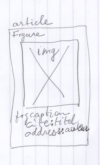
article wireframe naar html - Je kan de afbeeldingen van de covers downloaden van bookcover.zip en in de map image/cover plaatsen.
- De HTML basisstructuur voor 3 artikels:
<article> <figure><img src="image/cover/Carolyn Stee---De hongerige stad.jpg" alt="cover van het boek De hongerige stad geschreven door Carolyn Stee"> <figcaption><cite>De hongerige stad</cite> <address>Carolyn Stee</address> </figcaption> </figure> </article> <article> <figure><img src="image/cover/Fatiha Agag-Boudjahlat---Le grand detournement.jpg" alt="cover van het boek Le grand detournement geschreven door Fatiha Agag-Boudjahlat"> <figcaption><cite>Le grand detournement</cite> <address>Fatiha Agag-Boudjahlat</address> </figcaption> </figure> </article> <article> <figure><img src="image/cover/Hans Rosling - Ola Rosling - Anna Rosling Ronnlund---Feitenkennis.jpg" alt="cover van het boek Feitenkennis geschreven door Hans Rosling - Ola Rosling - Anna Rosling Ronnlund"> <figcaption><cite>Feitenkennis</cite> <address>Hans Rosling, Ola Rosling, Anna Rosling Ronnlund</address> </figcaption> </figure> </article> - Stand van zaaken
Als we de webpagina laden krijgen we het volgende te zien: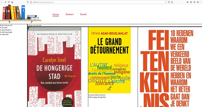
article vertrekpunt -
In het voorbeeld is er geen beperkingen opgelegd aan de grootte van het artikel. We beperken de basisgrootte tot 300px. We laten niet toe dat het artikel groter wordt. Wel kleiner en we voegen rondom witruimte toe. Tenslotte willen rond de content overal rond witruimte (padding). Dan doen we met de volgende stijlregel:
body>div>main>section:nth-child(2)>article { display: flex; flex-basis: 300px; flex-grow: 0; flex-shrink: 1; flex-direction: column; border: solid black 1px; padding: 1em; } - We willen dat de witruimte die op flexlijn overblijft evenredig rond alle artikels verdeeld wordt. Als de viewport smal is willen we extra padding aan de container toevoegen.
body>div>main>section:nth-child(2) { display: flex; flex-direction: column; justify-content: space-around; padding: 0 30% 0 30%; } - Als het scherm breder wordt dan 600px veranderen we van flexrichting en nemen we de padding weg:
@media (min-width: 600px) { body>div>main>section:nth-child(2) { flex-direction: row; padding: 0 0 0 0; } } - Het img element moet de hele breedte van het ouderelement (article) innemen:
body>div>main>section:nth-child(2)>article img { width: 100%; /* even breed als article */ } - Resultaat
- mobile
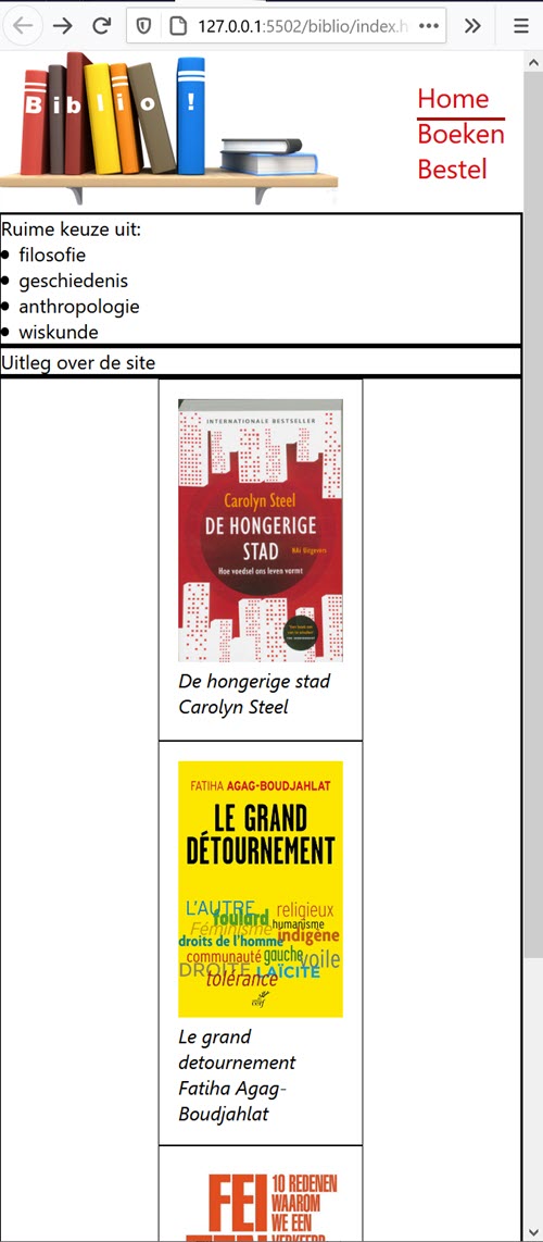
article eindresultaat mobile - computerscherm
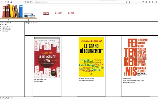
article eindresultaat computerscherm
- mobile
- De volledige CSS
* {
    box-sizing: border-box;
    margin: 0;
    padding: 0;
}

/**
 * Make body at least 100% height
 * You can  use a combination
 * of height: 100% in <html> and
 * height: 100% in <body>.
 */
html {
    height: 100%;
    width: 100%
}

body {
    height: 100%;
    width: 100%;
    display: flex;
    flex-direction: column;
    font-family: 'Segoe UI', Tahoma, Geneva, Verdana, sans-serif;
}

/**
 * Let's do a column distribution
 * (mobile first)
 * flex value is 1 1 auto to make
 * body skrinkable and extensible
 */

body>div {
    display: flex;
    flex-grow: 1;
    flex-shrink: 1;
    flex-basis: auto;
    flex-direction: column;
}

/**
 * Content body item is made
 * extensible too.
 */
body>div>main {
    flex-grow: 1;
    flex-shrink: 1;
    flex-basis: auto;
    display: flex;
    flex-direction: column;
}

/**
 * sections in main are made
 * extensible too.
 */
body>div>main>section {
    flex-grow: 1;
    flex-shrink: 1;
    flex-basis: auto;
    border: solid black 2px;
}

/**
 * Let's do a column distribution
 * (mobile first)
 */
body>div>main>section:nth-child(2) {
    display: flex;
    flex-direction: column;
    justify-content: space-around;
    padding: 0 30% 0 30%;
}

body>div>main>section:nth-child(2)>article {
    display: flex;
    flex-basis: 300px;
    flex-grow: 0;
    flex-shrink: 1;
    flex-direction: column;
    border: solid black 1px;
    padding: 1em;
}

body>div>main>section:nth-child(2)>article img {
    width: 100%;
    /* even breed als article */
}

body>div>aside {
    border: solid black 2px;
}

body>header {
    flex-grow: 0;
    flex-shrink: 0;
    flex-basis: auto;
    display: flex;
}

/* horizontale navigatie */
.logo {
    display: block;
    /* float: left; niet meer nodig, staat in een flex-container */
    /* height: 100%;
    width: 15%;  niet meer nodig, we gebruiken flex-grow en flex-shrink */
    flex-grow: 0.2;
    flex-shrink: 0;
    flex-basis: 160px;
    /* background-image: url(../image/logobookshelf.png);
    background-size: contain;
    background-repeat: no-repeat; */
}

.logo img {
    height: 130px
}

.horizontal-nav {
    /* width: 85%;
    height: 100%;
    padding: 1rem 0 0 0; is nu gecentreerd door align-self */
    flex-grow: 0;
    flex-shrink: 0;
    flex-basis: auto;
    align-self: center;
    display: flex;
    flex-direction: column;
}

.horizontal-nav a {
    margin-left: 4rem;
    text-decoration: none;
    cursor: pointer;
    color: #E20513;
    /* AP rood */
    font-size: 1.4rem;
    position: relative;
}

.horizontal-nav a::after {
    position: absolute;
    top: 0;
    left: 0;
    content: '';
    border-bottom: #AD0F09 solid 3px;
    /* AP donker rood */
    width: 0;
    background: transparent;
    transition: width .2s ease, border-bottom .3s ease;
    text-align: center;
    height: 2rem;
}

.horizontal-nav a:hover::after, .horizontal-nav a.selected:after {
    width: 100%;
}

/* text elementen */
ul {
    list-style-position: inside;
}

/**
 * Let's introduce bigger screen

 */
@media (min-width: 600px) {
    /**
     * Body items are now side by side
     */
    body>div {
        flex-direction: row;
    }
    /**
     * Sidebars have a basic 260 width
     * and are not really flexible anymore
     */
    body>div>aside {
        flex-grow: 0;
        flex-shrink: 0;
        flex-basis: 260px;
    }
    body>div>main>section:nth-child(2) {
        flex-direction: row;
        padding: 0 0 0 0;
    }
}

@media (min-width: 800px) {
    .logo img {
        height: 180px;
    }
    .horizontal-nav {
        flex-direction: row;
    }
}
2020-11-08 16:19:43